From Paper Circular to Online Service Page
Compare paper circulars with online service pages and use a worked example to judge whether navigation makes the right task easier to find.
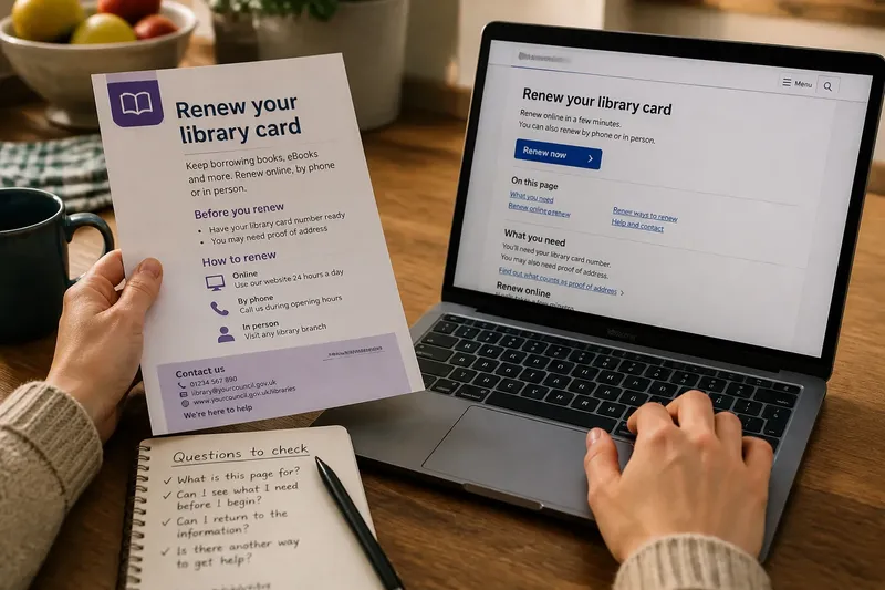
A paper circular lies open on the kitchen table, with its heading, instructions and contact details visible together. An online service page may show a title and a few links, while the rest appears only after scrolling or choosing a route. The change from paper circular to online service page affects how readers see their choices, find details and recover from a wrong turn.
What changes when the whole page is no longer in view?
A printed circular presents its contents on a bounded surface. Readers can glance from the headline to a note at the bottom, turn the sheet over or lay it beside another document. Even when the page is crowded, its edges make the start and end easy to recognise.
A service page divides that surface into screen-sized views. A reader may first see the page title, a short explanation and a prominent button, while eligibility, required documents and contact options sit farther down. Scrolling reveals more, but it does not make every section equally visible at the outset.
This changes the first reading task. With a circular, someone can scan the whole sheet and decide which paragraph matters. Online, the reader must also judge whether a link leads to the relevant section, another page, a form or an external system. Layout is part of the instruction, not just its decoration.
How does navigation shape the reading route?
Print usually offers a mostly fixed sequence: heading, explanation, conditions, action and contact details. A reader can depart from that order, but the document itself presents few paths. A web page can offer a contents menu, related links, expandable panels, tabs and buttons. These may help someone reach an answer quickly, but they also ask the reader to interpret the structure before acting.
Labels matter. “Apply” signals an action; “Eligibility” signals a question to answer; “More information” leaves the destination unclear. Distinct task labels are more useful than repeated “Read more” prompts, especially for someone arriving from a search result or a forwarded link rather than the service homepage.
Say a resident wants to know which documents to bring when replacing a travel pass. A contents menu labelled “What to bring” points to the relevant section, after which the resident can return to the application route. If the same information sits behind an unnamed “Details” link, the resident has to guess what will open and whether the current page will remain easy to find.
Why do headings and visual hierarchy carry more weight online?
On paper, spacing, type size and placement distinguish a title from a paragraph while keeping both in view. Online, those cues must work across screen sizes and remain useful to people using a keyboard or screen reader. A heading should describe the section, not merely announce that one follows.
Clear headings support scanning. “Before you apply” tells readers what to expect and when it matters. “More” gives little help to someone deciding whether to pause or continue. On a small phone screen, descriptive headings act as landmarks along a longer route.
Visual emphasis can mislead if used carelessly. A large button may look like the only available action even when a phone option or assisted route is farther down. A prominent warning can also crowd out the ordinary explanation people need first. Strong layout makes the main route visible without hiding other ways to get help.
What can a service page offer that a circular cannot?
A web service can connect an explanation directly to an action. A reader may move from requirements to an application, check opening hours, download a form or find a contact channel without handling separate sheets. Online information can also be updated without distributing a new printed copy when instructions or service arrangements change.
Those connections create dependencies. A link may lead to a separate page with a different title, a file that opens in another programme or a system that asks the reader to begin again. Link text should name the destination or task. Where it affects the next action, a short note can say that a link opens a file or starts an application.
Print has its own strengths: a circular can be kept, marked, shared in person or read without an internet connection. An online page can be searched and can connect people to current actions. Neither format automatically serves every reader better. The useful question is whether each makes the next decision clear.
Which questions help readers judge an online route?
Can I tell what this page is for?
Check whether the title and opening lines name the service and its purpose. If they could describe several different tasks, then look for a more specific heading or service description before proceeding; if they do not clarify the task, use the service’s contact route to confirm where to go.
Can I see what I need before I begin?
Look for eligibility, required documents, timing and conditions that affect the route. If a button appears before those details, check whether its label explains what it starts; if not, find the relevant requirements section or contact the service before submitting anything.
Can I return to the information I was reading?
Check for descriptive headings, a contents list or a visible route back to the service page. If those are present, use them to return to the earlier section; if they are absent, keep the page open while following the link or use the service’s own navigation rather than assuming the browser’s back button will restore your place.
Is there another way to get help?
Look for a relevant contact method or assisted option if the online route is unsuitable. If one is shown, use the option that fits your need; if none is visible, check the service’s contact details before assuming the button is the only route.
How would these questions work on a real reading route?
Imagine a resident has a printed circular about renewing a library card and opens the council service page from a search result. The invented page shows a button labelled “Renew now”, but its opening lines do not say whether proof of address is needed. The resident’s immediate decision is not whether to press the button; it is whether the page explains the requirements and offers a way to check them first.
The resident scans the page and finds a contents link labelled “What you need”. It leads to a section listing a library card and proof of address, followed by a heading called “Renew online”. The resident returns to that heading, sees that the button starts an application, and notices a phone contact option lower on the page. The observable result is a clear choice: proceed online with the listed items, or call to ask about the documents before starting. If the contents link had instead been labelled “More”, the resident would have had to open it to learn whether it contained requirements, making the route less certain.
This worked reading route shows what good navigation needs to accomplish: name the information behind a link, make the next action understandable and leave readers able to choose another route. The invented details are illustrative; an actual service page may set different requirements, which should be checked on that page or with the service.
What is not worth the effort?
It is rarely useful to recreate a printed circular on screen by squeezing every detail into one long block. Nor does a contents menu solve a page whose headings are vague or whose links all sound alike. More navigation is not automatically better navigation.
Keep the page’s main purpose visible, group related details under specific headings and name links for their task or destination. If a service offers several routes, describe them in terms readers recognise rather than internal team names. A brief explanation beside an unfamiliar route can prevent readers from mistaking it for another service.
When comparing a paper circular with an online service page, check whether each format makes the choices visible and gives readers a way to move between them. A useful page does more than point towards an action: it lets someone find the detail they need, understand what a link will do and pause without losing their place.